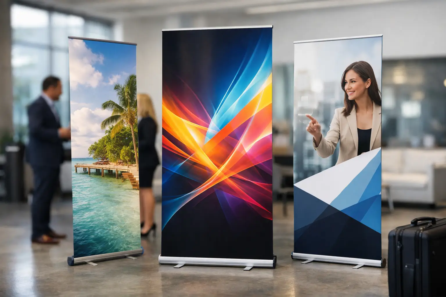
A roller banner has roughly three seconds to do its job. At a busy exhibition, in a shop entrance or beside a registration desk, people will not stop to read a full company profile. The best pop up banner design ideas make the offer clear from a distance, give people one reason to care and point them towards the next action.
For a business working to a deadline, that simplicity is good news. You do not need an over-designed banner to look professional. You need a strong message, a sensible layout and print-ready artwork that still works when it is pulled up to full height.
1. Lead with one message people can read at a glance
Put the main benefit at the top of the banner, where it is visible above a crowd, a display table or a stand. This is not the place for a long slogan. Use a short statement that says what you do, who it is for or what makes the offer worthwhile.
“Same-Day Repair Service”, “Freshly Prepared Office Catering” or “Free Property Valuations” are easier to understand than a broad line such as “Delivering excellence for every customer”. If your audience cannot explain your offer after walking past, the banner is trying to say too much.
Keep the headline large and give it room to breathe. A clean design with a clear focal point usually beats a crowded layout full of competing messages.
2. Build your pop up banner design around the reading order
Most people scan a banner from top to bottom. Use that behaviour rather than fighting it. Place your logo and headline near the top, the key visual or proof point in the middle, and contact details or a call to action towards the bottom.
Think of the banner as a quick conversation. First, tell people what you offer. Next, show why it is useful or credible. Finally, tell them what to do next. This structure works for trade shows, reception areas, local promotions and retail displays because it removes unnecessary effort for the viewer.
Avoid placing vital copy right at the bottom of the artwork. Banner bases, bags and nearby furniture can hide that area. Keep phone numbers, web addresses and QR codes clearly above the lowest section.
3. Use one strong image, not a gallery
A sharp, relevant photograph can give a banner immediate impact. A kitchen company may show a finished kitchen in use; a recruitment business may use an authentic image of its team; a beauty clinic may focus on a polished treatment result. The image should support the message, not simply fill an empty space.
Small photo collages often look busy from a distance. If you genuinely need to show several services, use simple graphic icons or separate the offers across more than one banner. One banner promoting one main service is usually easier to absorb.
Always use high-resolution images supplied at the correct size for print. A good image can look poor when enlarged if it has been taken from a website, social media post or screenshot.
4. Make the offer impossible to miss
If the banner supports a time-sensitive campaign, put the offer at the centre of the design. Use a contrasting colour block, a large price or a short promotional line such as “20% Off This Month” or “Book Before Friday”.
There is a trade-off here. Discount-led messaging can produce a fast response, but it can also make a premium service look cheap if it becomes your only message. For higher-value brands, focus on an added benefit instead – a free consultation, priority appointment, extended guarantee or event-only package.
The important point is clarity. A viewer should not need to search for the reason to act.
5. Let your brand colours do useful work
Consistent colours make your banner recognisable alongside your flyers, business cards, posters and social channels. Use your main brand colour for the strongest visual areas, then add a secondary colour only where it improves hierarchy, such as a call-to-action panel or key statistic.
High contrast matters more than fashionable colour combinations. Dark text on a light background is generally easiest to read. White text can work well on a solid dark panel, but it becomes harder to read over a detailed photograph. If in doubt, place copy on a plain colour block.
Do not rely on colour alone to communicate meaning. A price, date or instruction should still make sense in words, particularly for viewers seeing the banner quickly from a distance.
6. Use proof that makes people trust you
A banner does not have space for every testimonial, certification or statistic, but one specific proof point can add real weight. Consider a line such as “Trusted by 500+ local businesses”, “Rated 4.9/5 by customers” or “Established in Manchester since 2008”.
Choose proof you can stand behind. Vague claims such as “The Best in Town” are easy to ignore. A specific fact feels more credible and gives people a reason to start a conversation at your stand.
For professional services, industry accreditations and awards can work well. For retailers and food businesses, a customer rating, local heritage or a clear quality promise may be more relevant.
7. Create a campaign pair, not a lone banner
A roller banner works harder when it matches the rest of your event or promotion. Use the same headline, offer, colours and imagery on leaflets, posters, table cards or a step-and-repeat backdrop. Repetition helps people remember the message after they have moved on.
This does not mean every item needs identical artwork. Your leaflet can carry more detail, while the banner does the attention-grabbing. The banner should be the visual signpost; supporting print should answer the questions it creates.
For a larger stand, two banners can also work as a pair. One can introduce the company and build trust, while the other promotes a specific product, service or event offer.
8. Make QR codes practical, not decorative
A QR code is useful when it takes people somewhere worthwhile: a booking page, a menu, an event registration form, a product brochure or a limited-time offer. Put it beside a direct instruction, such as “Scan to book your free consultation”.
Make the code large enough to scan comfortably and leave clear space around it. Test it with several phones before sending artwork to print. A QR code that is too small, too low down or placed over a patterned background creates frustration rather than leads.
If the next step is simply calling or visiting, a large phone number and short web address may be more practical. The right choice depends on where the banner will be used and how much time people have to engage.
9. Design for the real venue
Before finalising the artwork, consider the setting. An exhibition banner needs to compete with surrounding stands, so a bold headline and minimal detail are essential. A banner in a quiet reception area can include slightly more information because visitors have longer to look.
Retail banners need a clear product, price and deadline. Conference banners often work better with a service benefit, credentials and a conversation starter. Outdoor-facing displays need especially strong contrast, as sunlight and reflections can reduce readability.
Also think about the viewing distance. Text that looks fine on a laptop can become tiny on a full-height banner. Step back from your screen or print a scaled proof to check whether the message still reads quickly.
10. Keep typography simple and oversized
Use no more than two typefaces and avoid elaborate scripts for important information. A readable sans-serif font is usually the safest choice for headings, prices and contact details. Reserve decorative type for a small brand element only, if it suits your identity.
Size matters more than most people expect. The headline should be readable from several metres away, while supporting copy needs to stay brief enough to remain legible. If a paragraph feels necessary, it probably belongs on a leaflet rather than a pop up banner.
Check every detail before approval: spelling, dates, prices, telephone numbers, logos and web addresses. Reprinting because of one wrong digit costs more time than a final careful review.
11. Use space as part of the design
Empty space is not wasted space. It separates key elements, makes a headline more noticeable and stops the banner feeling like a noticeboard. A common mistake is adding every service, every logo and every selling point because there is room on the template.
Instead, decide what the banner must achieve. It might be to attract people to a stand, promote one seasonal offer, direct visitors to a counter or make a business look established in a meeting space. Once that purpose is clear, remove anything that does not support it.
12. Prepare artwork properly for fast printing
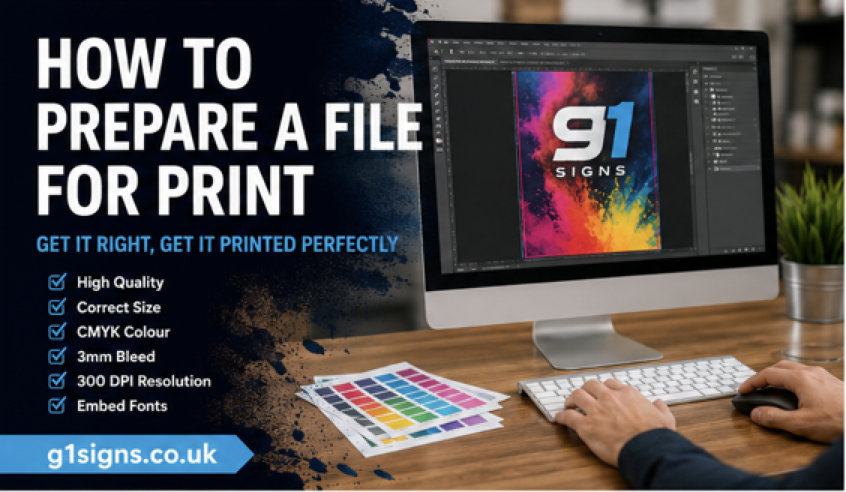
Urgent printing only helps when the file is ready to produce. Supply artwork at the correct banner dimensions, use high-resolution images and convert colours appropriately for print. Keep important content away from edges and the lower cassette area, and make sure logos are supplied in a clean, sharp format.
If your deadline is close, choose a proven layout over a complicated concept that needs repeated amends. G1 Printing can produce practical event and promotional print quickly, but clear, final artwork is still the fastest route from screen to display.
A well-designed banner should make your next customer pause, understand the offer and know exactly where to go from there. Start with one clear message, check it from a few metres away, and let the printing do the rest.